

 Intro
Intro
Theta Care
Forging a healthcare frontier.
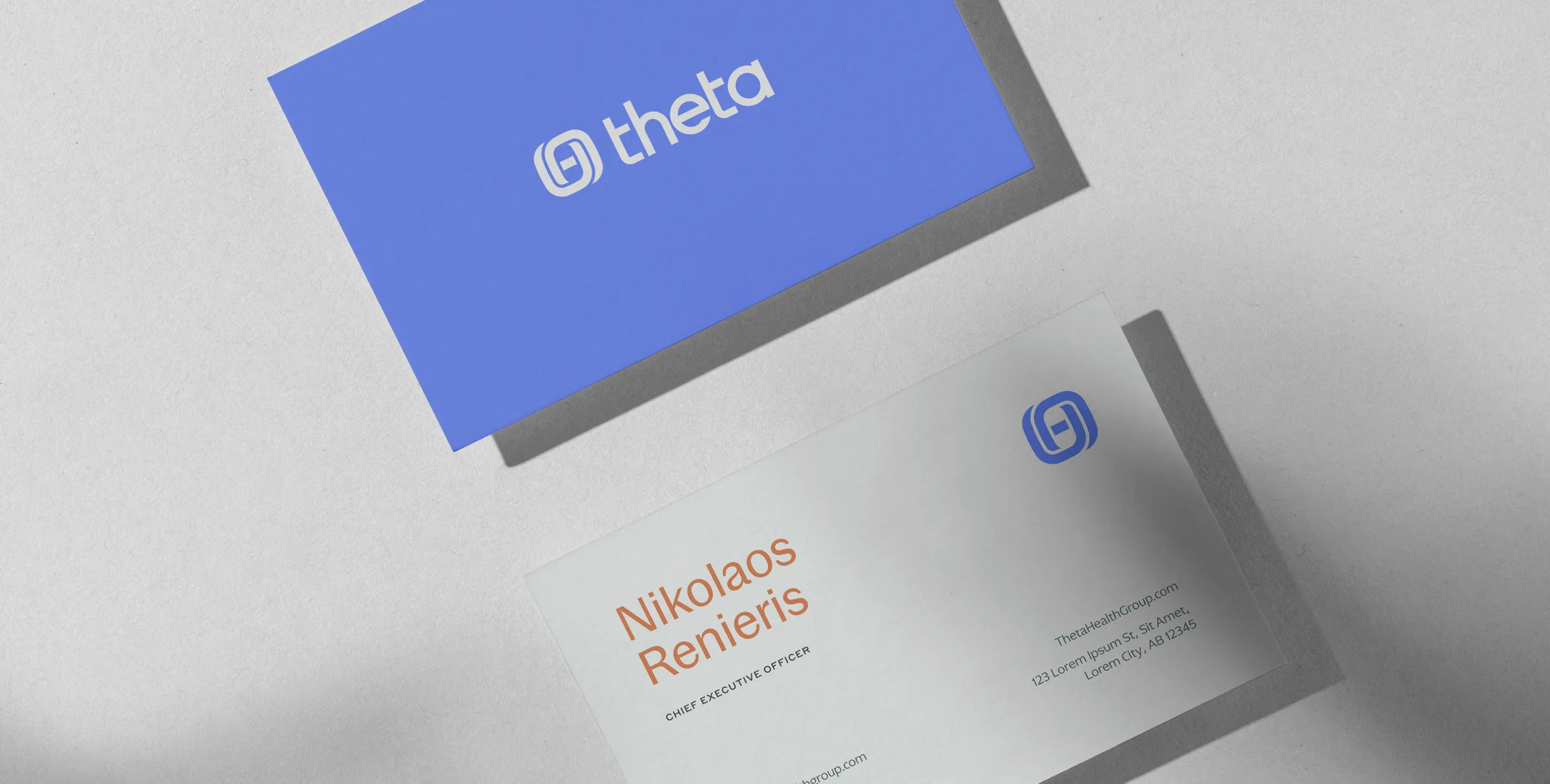
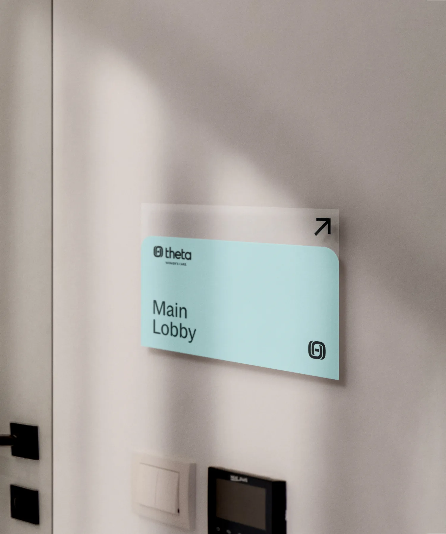
Investors sought a distinctive healthcare franchise combining spa-like experiences with pharmaceutical access. 321 developed a comprehensive brand identity — including the name Theta Care — informed by patient-centered care principles and Greek aesthetic influences.
The name is the result of our workshop and research, where we studied Picker's 8 Principles of Patient-Centered Care and the brand's proclivity toward Greek aesthetics — theta is the 8th letter of the Greek alphabet.
The cyclical logo symbolizes regenerative, integrated healthcare. Its swirling motion around a central core represents life cycles and the need for support systems — embodied by the Theta brand itself.
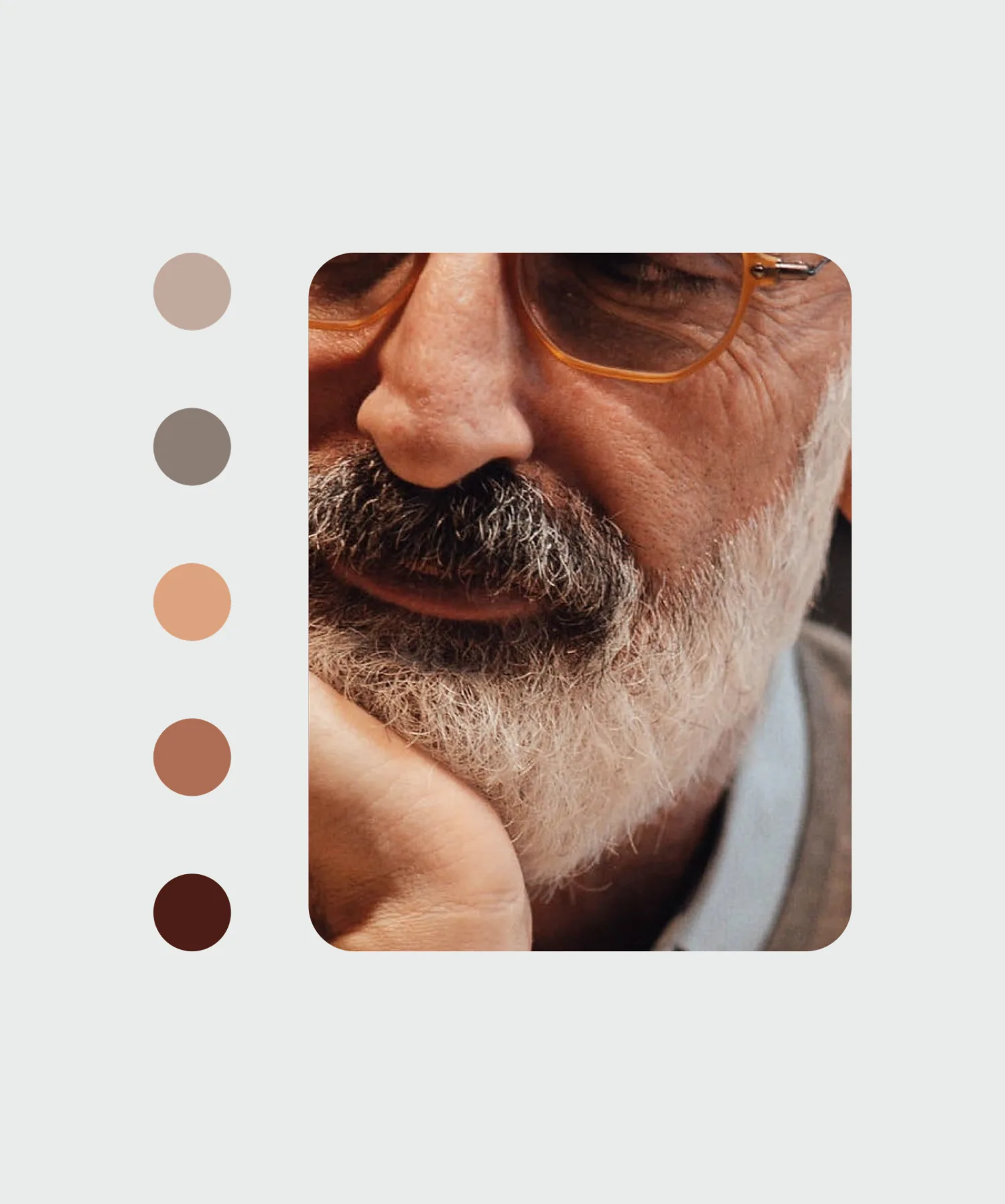
Brand development drew heavily from Cycladic architecture, the Greek style popularized in modern Mediterranean spas. The visual palette combines robust, rounded forms with bright neutrals. When paired with lifestyle photography, the medical identity shifts from clinical appearance to something resembling home goods aesthetics.
The launch campaign positioned Theta Care as an industry leader within the regenerative clinical spa space, emphasizing their heritage as a healthcare conglomerate and the spectrum of services offered. Research indicated that pursuing a "centered life" motivated the target audience when selecting healthcare providers and pharmaceutical brands.