Intro
Intro
Vitreus
A faster, safer, more profitable crypto.
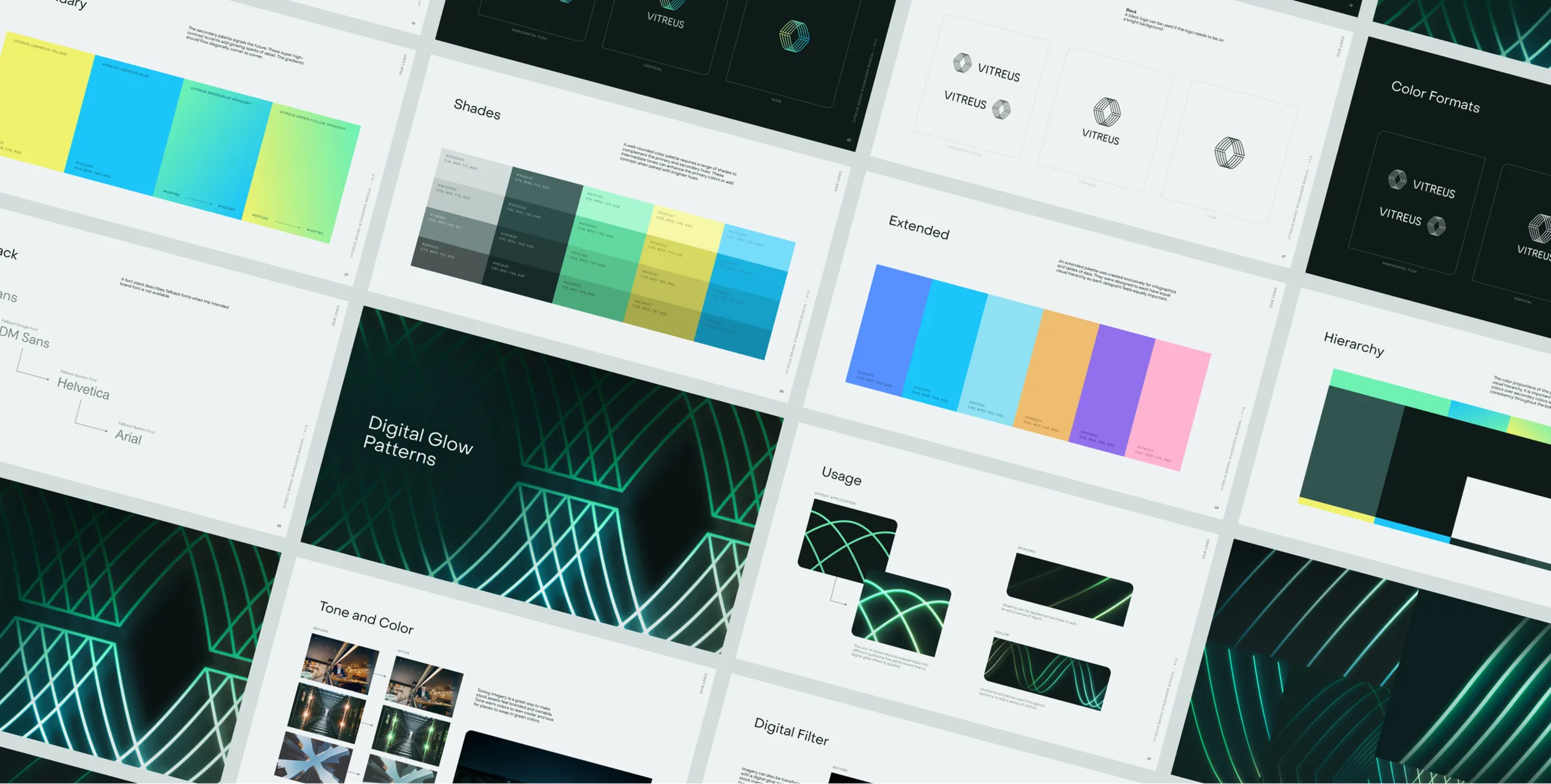
VITREUS sought brand redefinition from 321. Through logo redesign and new color palette creation, they achieved a visual identity embodying transparency, security, and innovation in financial services.
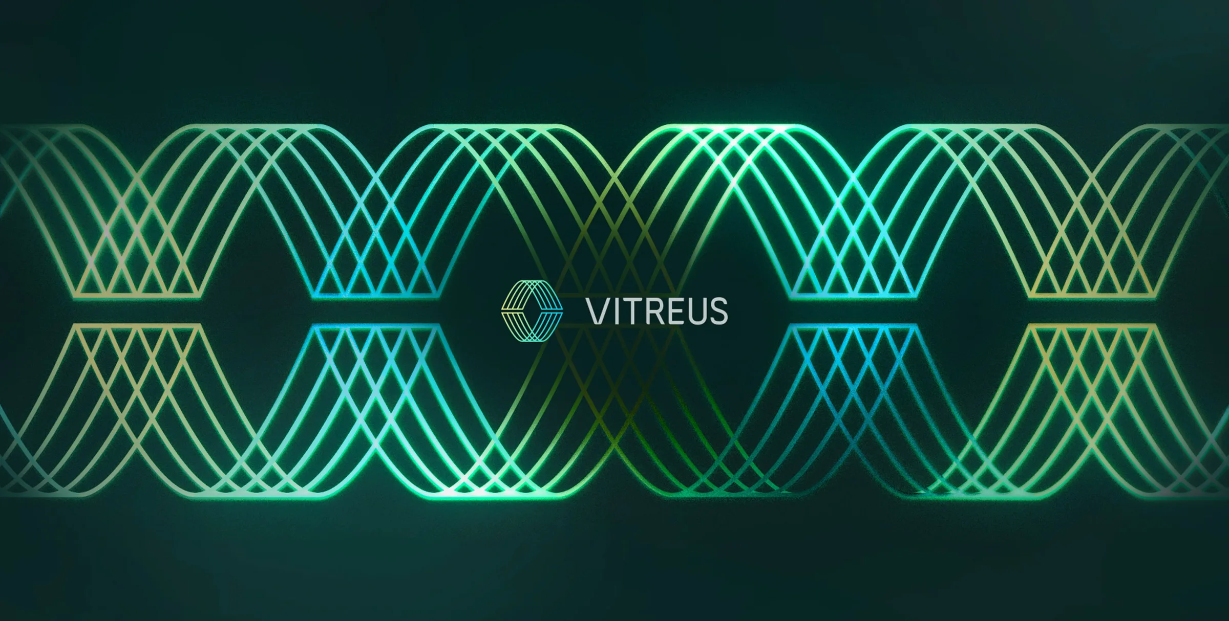
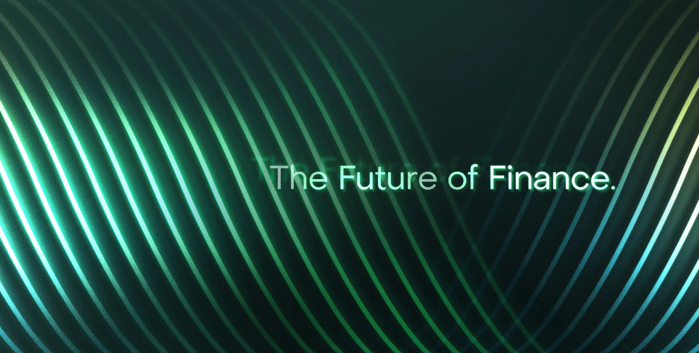
We drew inspiration from the guilloche patterns on paper currency to create the helix pattern in VITREUS' new branding.
The guilloche pattern traditionally adorns paper currency as a security measure — directly reflecting one of VITREUS' core operational pillars. This design choice bridges aesthetic sophistication with functional meaning, signaling the company's commitment to safeguarding client assets.
VITREUS is a financial services digital ecosystem designed to redefine long-term investing and scalable infrastructure solutions. The brand overhaul encompassed comprehensive work across brand framework development, logo exploration, and color palette refinement, establishing a cohesive visual language for market launch.
The redesigned identity communicates VITREUS' positioning within the cryptocurrency sector while differentiating the company through deliberate artistic direction that prioritizes clarity and trustworthiness.